Politicians are often accused of manipulating statistics for their own ends; an accusation few of them would deny if they were being really honest. But in many cases, the “lies” that people refer to are lies of omission rather than flagrant falsehoods. Unlike a lot of people, I have quite a lot of respect for most politicians in Britain. This could be because I work in many of countries where the politics is a lot dirtier than it is over here, at least on the surface. So, perhaps naively, I trust British politicians to be, at worst, somewhat economical with the truth.
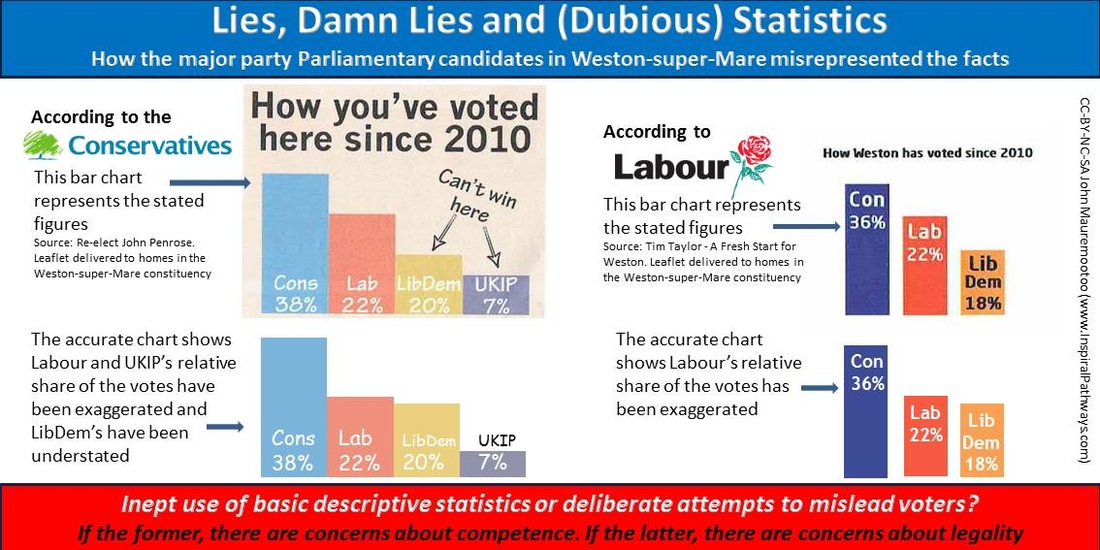
But en route to the recycling bin the other day, I was struck by what appeared to be blatant lies in the election leaflets of the Conservative and Labour Parties for our constituency of Weston-super-Mare. Both parties produced bar charts based on the results of local and European elections in the constituency since 2010 to justify voting for them - the charts are reproduced in the above infographic. The Tories and Labour used the charts to portray it as a two horse race between the major parties. In other words, a vote for any of the other parties would be wasted – “Only John Penrose can stop Ed Miliband and Ed Balls in Weston” proclaimed the Conservatives, with Labour firmly stating “If you want the Tories out of power locally and nationally, Labour is the only choice for you.” Both assertions may well turn out to be true but that is not the issue I am writing about in this blog.
At first glance I took the bar charts as being authentic reflections of the percentage voting figures they were meant to portray; but then I did a double-take when I realised that, in both cases, the size of the bars was way out of line with the percentages. Either the charts had been produced by somebody who was incapable of pre-GCSE maths, or they had been deliberately manipulated to suit the agendas of the respective parties.
The Tory leaflet portrayed Labour as being clear in second place with the LibDems a distant third and UKIP hard on their heels in fourth. But in fact the LibDems were only 2% behind Labour and UKIP were 13% behind the LibDems. The charts from the Labour leaflet portrayed a similar picture. In the Labour chart the LibDem vote was 18% and in the Conservative chart it was 20% but, to be charitable, this could be because different methods were used to calculate the figures because of confounding factors such as boundary changes.
So what conclusions can I draw from this? If it was a cock-up then it does not reflect well on the competence of these people who seek to lead the country in this information age. But we all make mistakes. So it should just be a question of the candidates - John Penrose for the Conservatives and Tim Taylor for Labour - holding up their hands and apologising for the human errors that were made. If the charts were deliberately exaggerated then it is a much more serious matter. I’m not an expert but surely that kind of behaviour is illegal. If it is not, then there is a loophole that is in urgent need of closing.
We keep hearing that trust for politicians in this country is at an all-time low. If facts are being routinely falsified then I am ready to reluctantly agree that this impression is well founded.


 RSS Feed
